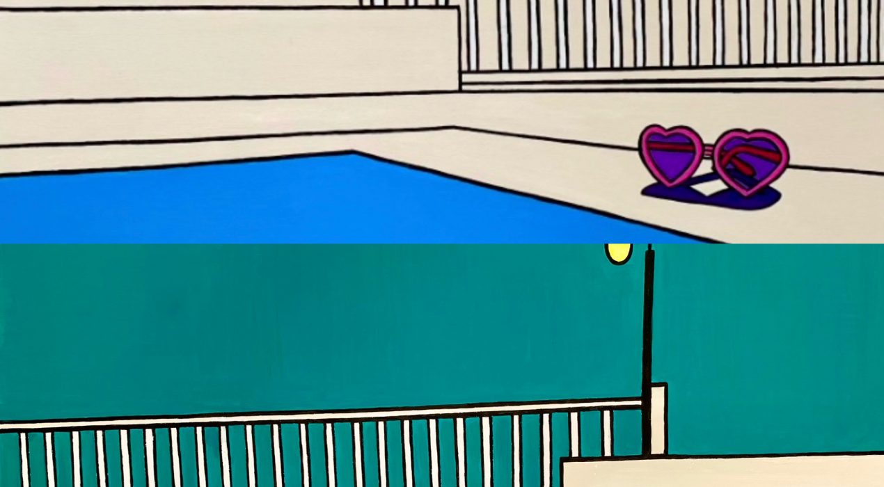
For some time I have been wrestling with going forward with my two styles of art, the small oil paintings of fruit/veg/flowers etc and the large acrylic LineArt/Pop Art pieces. I ended up getting ill trying to manage it all and with my enforced rest I made some decisions. I am putting the small oil paintings on hold for now. I will still be selling the larger prints of these artworks and also my greetings cards. www.juniqe.com always has a selection of my prints available and also http://www.northstreetgallery.com. If you are interested in any of those pieces, please get in touch, link at bottom of this post. My real passion though is for the PopArt which I have always labelled LineArt. I started painting in this style when I lived in Cape Town, the sunshine and bright colours there really inspired me. Personal circumstances meant I had to pause this for a while, but since discovering quite by chance the work of Michael Craig-Martin last autumn I am fired up again. Those colours! However my work is female related, by choice. I have two series on the go at the moment; ‘Alone Not Lonely’ about embracing and navigating life alone,…
Read More ›
As we go into 2025 I am fired up with new ideas, which is a good thing for an artist. I show here two images of my work, both part of my Alone Not Lonely series. I’ve been asking for feedback on both and that’s been interesting and constructive. The first, neutral piece inspired more comments about how it showed the essence of being alone, possibly lonely, which is very much not what I am. But the sparseness of the colour does seem to invoke emptiness. The cheerful sunspex however, bely that image, which is very much what I WAS aiming for. The second colourful piece, the ‘Michael Craig-Martin’ effect (see previous post/blog), also invoked comments along the lines of yes, being alone, but somehow happier because of the colours. I used whatever colour I thought worked, so not necessarily what you would expect, but MCM suggests the eye can work out the colours and I found that a lightbulb moment for me. I would be interested in any feedback. Email michetoots@gmail or Instagram @michewatkins
Read More ›
I would like explain my two very different types of art and sizing/ prices, because I am conscious it looks a little strange on the viewing page of my website. I have yet to learn how to separate the two into different headings. I began painting the large acrylic pieces, what I describe as Line Art, or popart themed work when I lived in Cape Town and absolutely loved creating these works. I used to paint mainly women without any facial detail, so slightly more abstract and sparse in composition. They worked and sold well through galleries there. On returning to the UK for personal reasons, I had to rethink what I painted. I came up with the concept of small oil paintings of anything that caught my eye, fruit, veg, flowers, fish, bottles of wine, donuts, you get my drift. Again, these have done well. People like to have 2/3 in their kitchen and I use bright Mediterranean colours to cheer one up. I kept the price down deliberately, to encourage people who might be new to the world of buying original art. These pieces are painted alla prima, so again take less hours to paint than the Line…
Read More ›